The year still has a few weeks left, but here are a few short reviews of other books I’ve read in 2023.
Elder Race
This was a fun one. A story written from two perspectives. One, a noble woman from a medieval society, the other an anthropologist from a massively advanced technological civilization The prior viewing the later as a wizard, the later attempting to do his job while failing a Star Trek-ish Prime Directive to not interfere in primitive societies (while also dealing with depression). It’s a quick read. It’s fun flipping back and forth between the two perspectives, each chapter either fantasy or sci-fi. There’s one point towards the end of the book that is excellent payoff for the genre flipping.
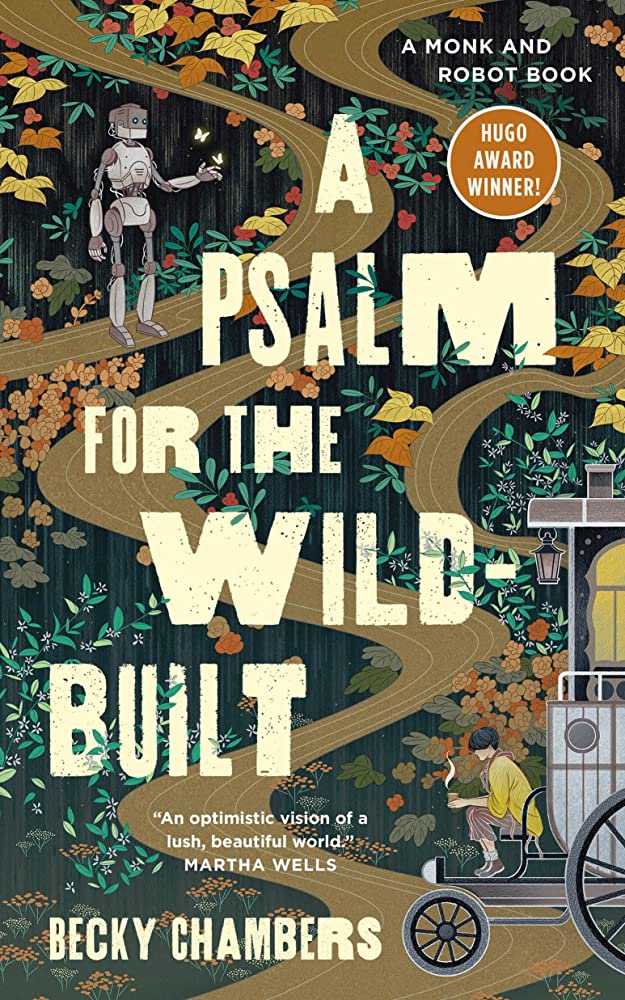
A Prayer for the Crown-Shy (Monk & Robot #2)
The sequel to A Psalm for the Wild-Built. A monk and robot walking through the forest didn’t feel as charming the second time around. It seemed like Becky Chambers was trying a little too hard to be philosophical and introspective. Like she knew her book was supposed to say something deep, but she couldn’t quite figure out what that parting wisdom was. You could definitely argue the same for the first book. As I’ve read more of her books, she frequently wavers on this line. I think more often than not, she doesn’t quite make it.
Six of Crows
Heists in a dark fantasy setting. At first I couldn’t stand the book. It felt like the author was trying a little too hard to be edgy. This isn’t your normal YA book, this one’s dark. I enjoyed it enough by the end, but I don’t think I’ll be reading the sequel.
The Fifth Season
I liked the book, but a good chunk of the third act felt out of place. Specifically the relationships that the book focuses on. They didn’t feel earned. It felt more like the author wanted to do something unique, and couldn’t find the right path towards that destination.
You could call this one grimdark. A lot of bad stuff happens… especially to kids. The world was mysterious and pulled me in. Won’t be re-reading this one, or the rest of the series.
Ejaculate Responsibly: A Whole New Way to Think About Abortion
The general ideas of this book were great. Men are fertile 100% of the time. Women are fertile for a couple days, unreliably, each month. A man could impregnate one woman every day for a year, while a woman can have a single child per year. The book continues on with the case that unwanted pregnancies are always blamed on women, when in reality, men are who cause all pregnancies. A woman can’t walk out on a pregnancy. As a society, we expect women to not just be responsible for their own body, but for men’s as well. Men should be the focus of stopping unwanted pregnancies. That’s all over simplified. The quality of the writing was varied. So were the points. Some really hit, while others felt out of place. Also, abortion access should be legally available everywhere.
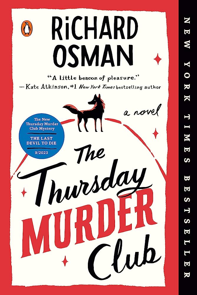
The Man Who Died Twice (Thursday Murder Club, #2)
A pleasing sequel. It was fun to see Joyce, Elizabeth and the gang again. Didn’t feel as special as the first book, but still very enjoyable. Go read the first book. Heck, give it a listen. It has a wonderful narrator.
The Long Way to a Small Angry Planet (Wayfarers, #1)
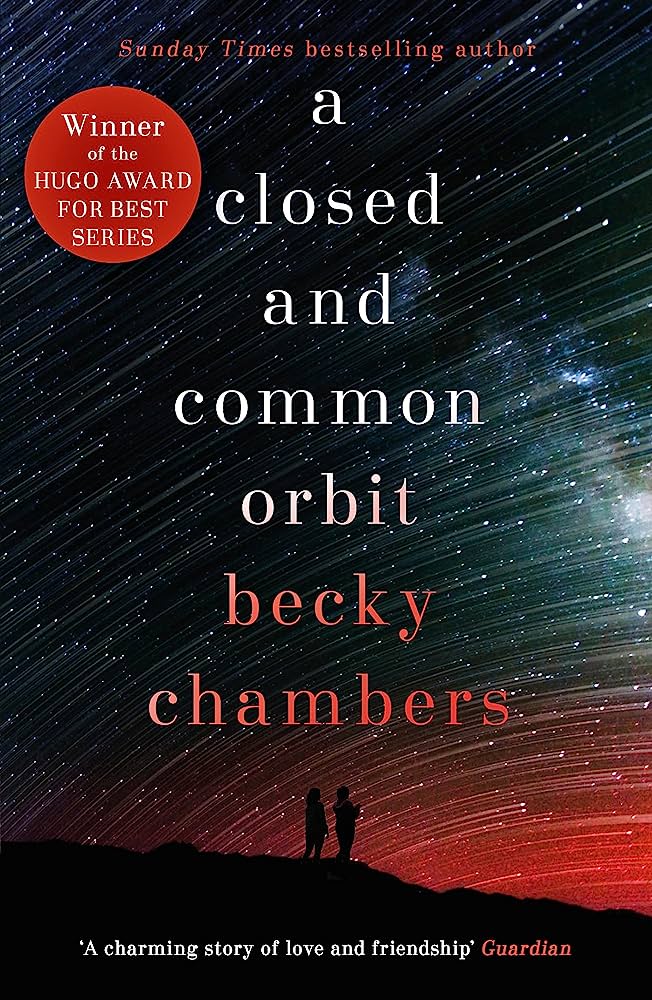
Feels very Firefly inspired. Especially the spunky engineer lady. Just replace her with Kaylee and I don’t think anyone would notice. Each chapter feels like an episode of a TV show. It’s a fun book with great characters in a universe that feels begging to be explored. I wrote more about it in my review of next book in the series, A Closed and Common Orbit.
The Galaxy, and the Ground Within (Wayfarers, #4)
Before reading my first Becky Chambers book at the start of the year, I had heard this book was one of her best. I liked it fine. It’s better than the first book, but A Closed and Common Orbit remains my favorite of the series. This one is slice-of-life, but with aliens. It’s enjoyable, but not outstanding. One small irk, she mentions the “oh there’s not a word in your language for a thing in my culture” thing too many times. Like 5 time too many. She obviously has a lot of fun inventing these alien races, and they are fun to read about. I just didn’t love it. Thinking back on The Long Way to a Small Angry Planet, there was a lot I enjoyed about the book, but also a lot I didn’t like. Chambers has definitely grown as a writer, but for most of the books of hers that I’ve read, she re-treads a the same ground. Frequently.
The Splendid and the Vile
I’ve read a few Erik Larson books. In the Garden of the Beasts probably being my favorite. This one was a little too loose. Too many threads. I still enjoyed learning about what a weirdo Churchill was.
Mistborn: Secret History (Mistborn, #3.5)
Oof. Sometimes I’ll read a single book or two in a big ‘ol series and then just stop. I like what I’ve read, but I feel like the author will ruin that feeling by continuing on with the story in ways I don’t enjoy. For example, I’ve read Dune maybe three times, but never any of the rest of the series. Secret History definitely falls in that category. It dives into what was happening behind the scene through the original Mistborn series. In an age where every single third-tier side character get’s their own TV show and an every possible plot line and multiverse is explored, I really prefer when not all questions are answered.
Fugitive Telemetry (The Murderbot Diaries, #6)
I guess I missed this one last year? It’s another Murderbot book! What’s not to like? This time Murderbot is solving a murder on a space station. Enjoyable, though not my favorite in the series. If you haven’t read the Murderbot Diaries, I recommend giving them a try. Quick reads (novellas! They’re great!), fun character to follow.
Number Go Up: Inside Crypto’s Wild Rise and Staggering Fall
The renaissance era was lousy with painters, we’re lousy with grifters. I have stubbornly refused to read/listen to anything crypto related. It’s always seemed like a scam. The financial crime investigative journalist, Zeke Faux, had a similar feeling. Instead of ignoring it he dove deep. Zeke spent a few years following the grifters, egos, and billionaires tied to crypto, from mansions to slave camps. His book feels almost too strange to be reality.