As I dabbled in making a podcast app over the years, one design element I always wanted to include was a tape deck UI. The inspiration of course came from Apple’s own Podcasts app, back from the skeuomorphic days of iOS.
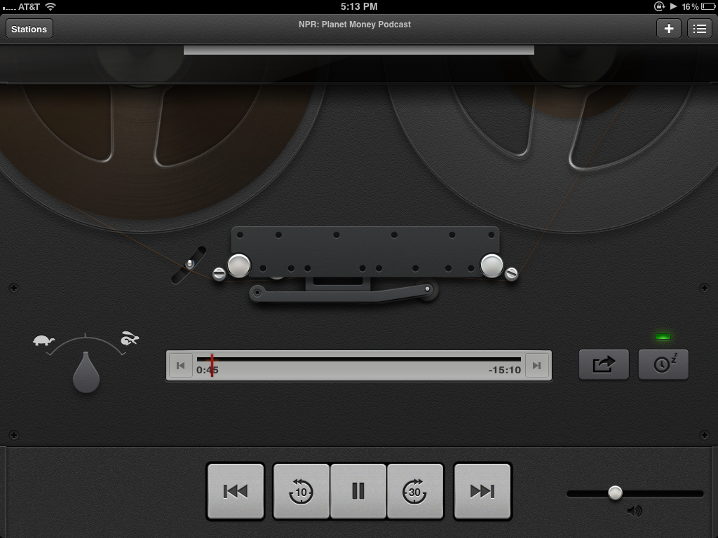
I loved that virtual replication of the tape deck. Watching the the spools spin, tape shrinking on the left and growing on the right. I remember being astounded when I noticed that tilting my iPod Touch would shift the reflection on the chrome knob of the volume slider. It was cool. I wanted to make something cool.
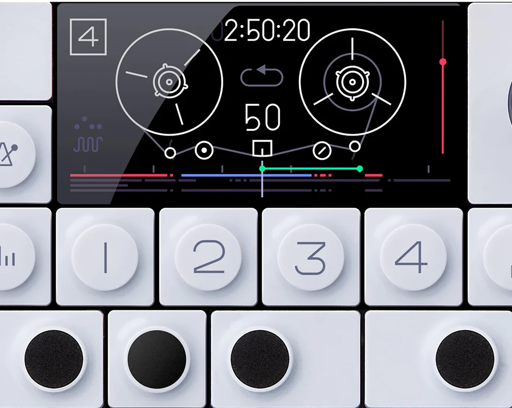
Graphic design being a skill I very much lack, I knew a skeuomorphic masterpiece like that would stretch beyond my ability. With realistic tape spools on the bench, I started looking into something more achievable. At first, I had the idea of using SpriteKit to make detailed, analogue representation of a podcast player in 2D pixel art. The user would browse through a cabinet of cassette tapes representing podcasts. Searching and subscribing would have a similar arcane and real-world analogue of an interface. Basically, a 16-bit game that was the interface to a podcast app. 😅 Obviously, this too was way beyond my skill. I finally came to my senses and decided to try something similar to the UI of Teenage Engineering’s OP-1. I loved the simplistic, striking line based interface of the little synthesizer and decided I would attempt to replicate it in my app.
The minimal UI representation of a tape and meters seemed much more apporachable than the gradients and depth of skeuomorphism’s past. With my inspiration and goal set, I started watching Sketch tutorials and got to work.
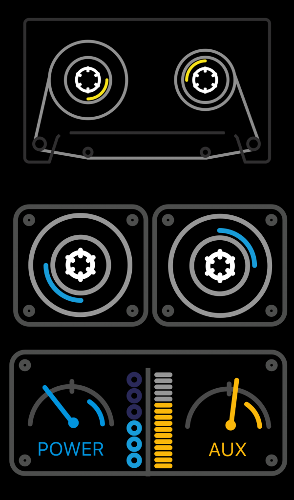
I replicated, and imitated, but I never quite ended up with something that was as cohesive and beautiful as the OP-1 interface. I was still happy with what I’d created. Though derivative, I learned how to use Sketch, I loved making the prototypes, I even got it working in Swift:
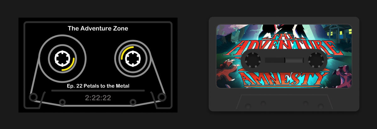
A couple years later, when the word “neumorphism” first started popping up on Twitter, I decided to make another go at designing the the case tape. While I fondly remembered my first attempts, they were too simple an imitation of a great design. This time, I decided I would do my own thing, and lean a (tiny) bit more into the skeuomorphic design of the original Podcasts app.
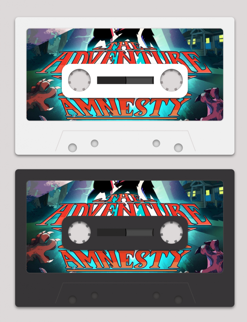
The new tape was still extremely simple. Again, I am no artist. My ability withstanding, I loved them. I still do, a few year later. I’m not sure how or even if I’d ever include something like them in an app in the future. My opportunities to do so are pretty limited. They make me happy though. Remind me of that original app from Apple. I hope more apps let whimsy design take the the stage.